Poor presentation slides
I am going to review the PowerPoint slides I had in the past. I made this PowerPoint slide when I was taking an Environmental Economics course. I was discussing Hazardous waste which hurts the environment. I listed the types of hazardous waste in this slide.
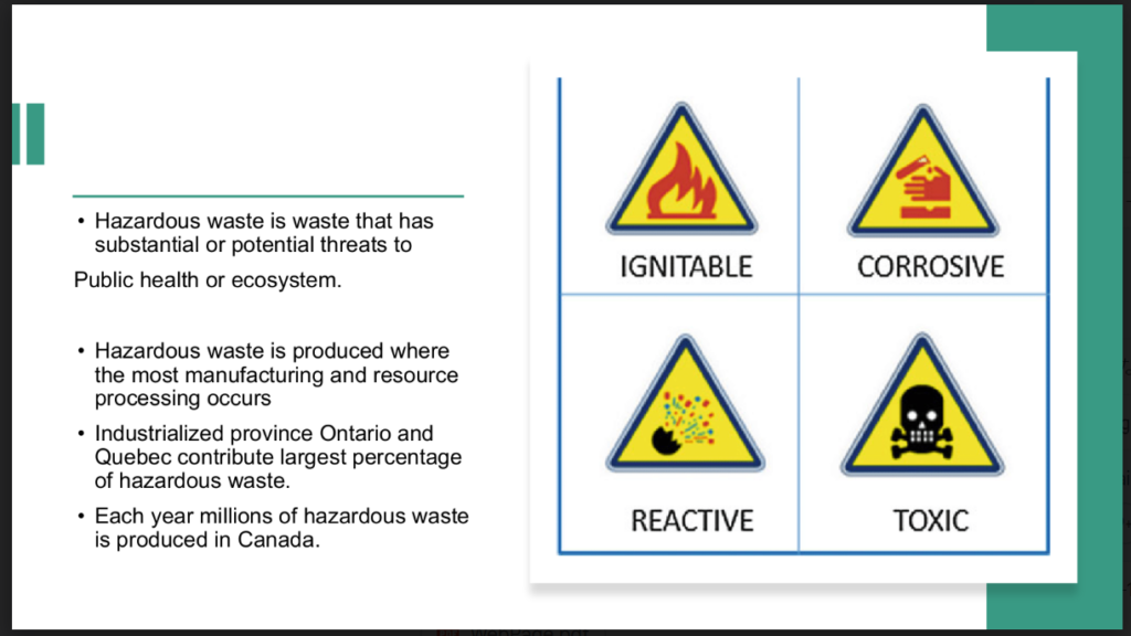
- I found the title is missing in these slides.
- The sides of the letter are the same.
- The color does not match the content of the slide.
- There is not enough room for each bullet point.
I could use the color contrast scheme to be more engaging. The green color does not give the harm or damage impacts.
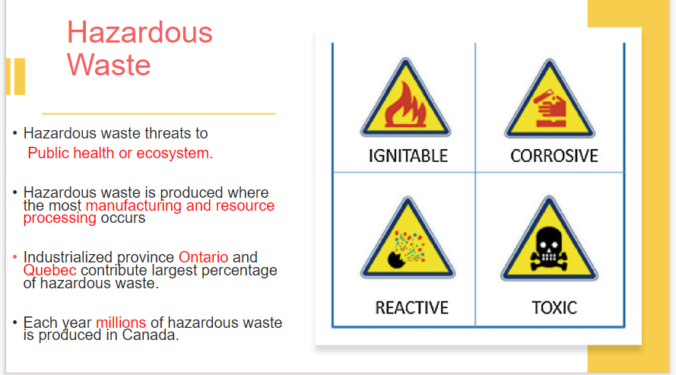
So I tried a little change here by following scheme. I changed color.
The yellow color gives a more warning or threatening impression and it matches the image. I also made the text red which I think is important. It gives more clear information and is easier to understand. I tried not to use too many colors just yellow, red, and black.
I made enough space on each bullet point to make it clear.
The common bad PowerPoint has too much text and the color does not fit the content.

Leave a Reply